Case Studies
Three.js Mobile App Experience (threejs-playbook)
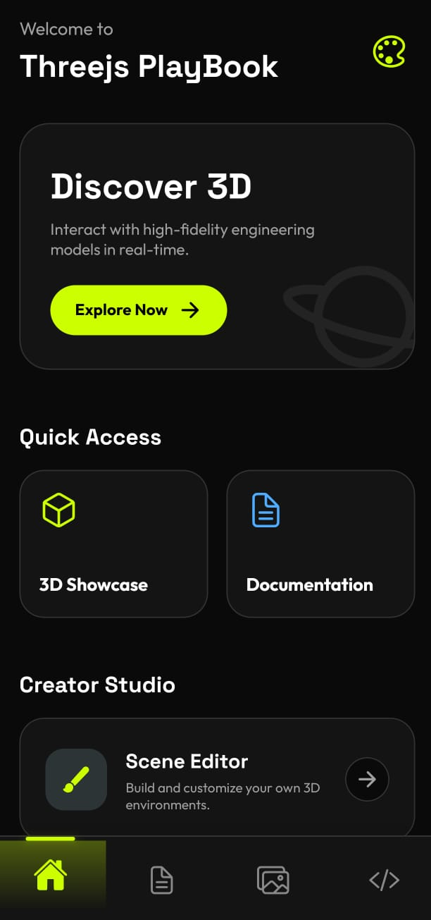
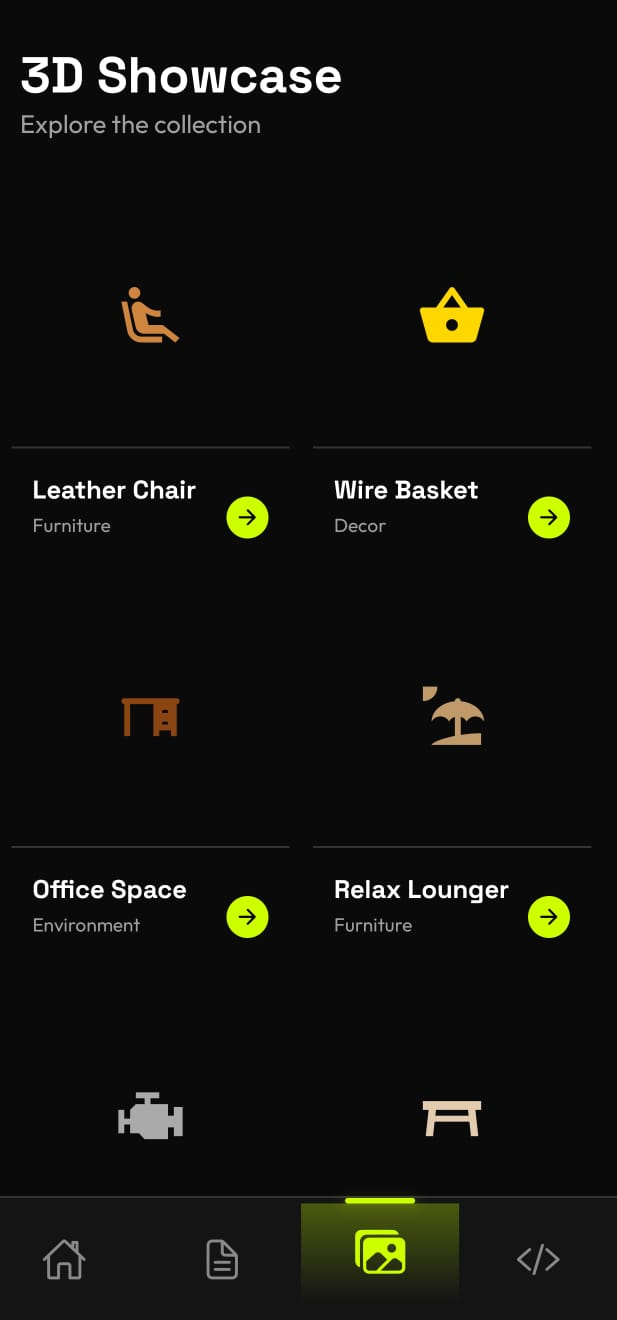
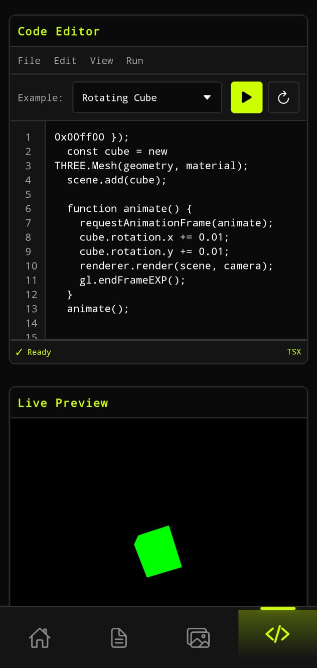
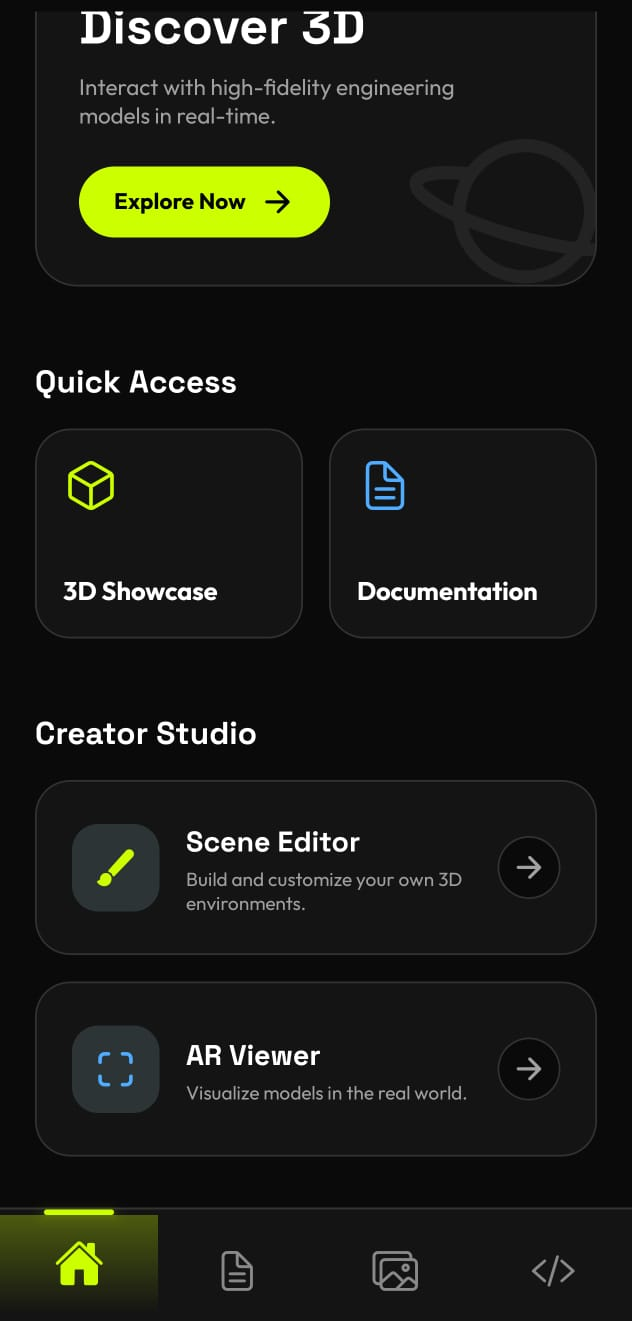
The Three.js Mobile App Experience is a premium, high-fidelity mobile platform designed to showcase and teach 3D graphics using Three.js within a native Expo/React Native environment.
It serves two primary roles: a learning hub for developers to master 3D web technologies on mobile and a demonstration gallery for high-performance 3D rendering.
Core Features
- Interactive 3D Showcase: A curated gallery featuring various high-quality 3D models including industrial components (Gate Valves, Elbows), furniture (Ash Table, Leather Chair), and consumer products (Detergent and Medicine Bottles). These are rendered in real-time with full orbit control.
- Educational Documentation: A comprehensive learning center with tutorials categorized by difficulty (Beginner, Intermediate, Advanced). Each tutorial includes structured learning content and code snippets.
- Live Code Editor: A robust "Playground" where users can write Three.js code directly on their mobile device and view a live simulation of the results. It includes pre-loaded templates like Cubes, Spheres, and Toruses.
- Themed User Experience: A highly polished UI supporting multiple visual themes (e.g., Standard, Cyber, and Midnight). It uses premium typography (Space Grotesk and Outfit) and fluid animations.
- Interactive Simulations: A unique feature that allows users to "Run Simulation" directly from a documentation page, opening a live 3D preview of the concept being discussed.
Technical Foundation
- Framework: Expo SDK 54 (React Native) with TypeScript.
- 3D Engine: Powered by three.js, integrated via expo-three and expo-gl for native OpenGL ES binding.
- Routing: Uses Expo Router for file-based navigation, implementing a custom bottom tab bar.
- Animations: Leverages react-native-reanimated for smooth UI transitions and micro-interactions.
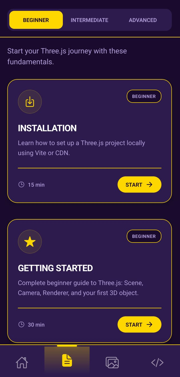
By leveraging a global ThemeProvider and high-performance OpenGL bindings, this app bridges the gap between web-based 3D graphics and native mobile performance. View on Play Store →
Studio Otaga: Visual Website Builder (No-Code Tool)
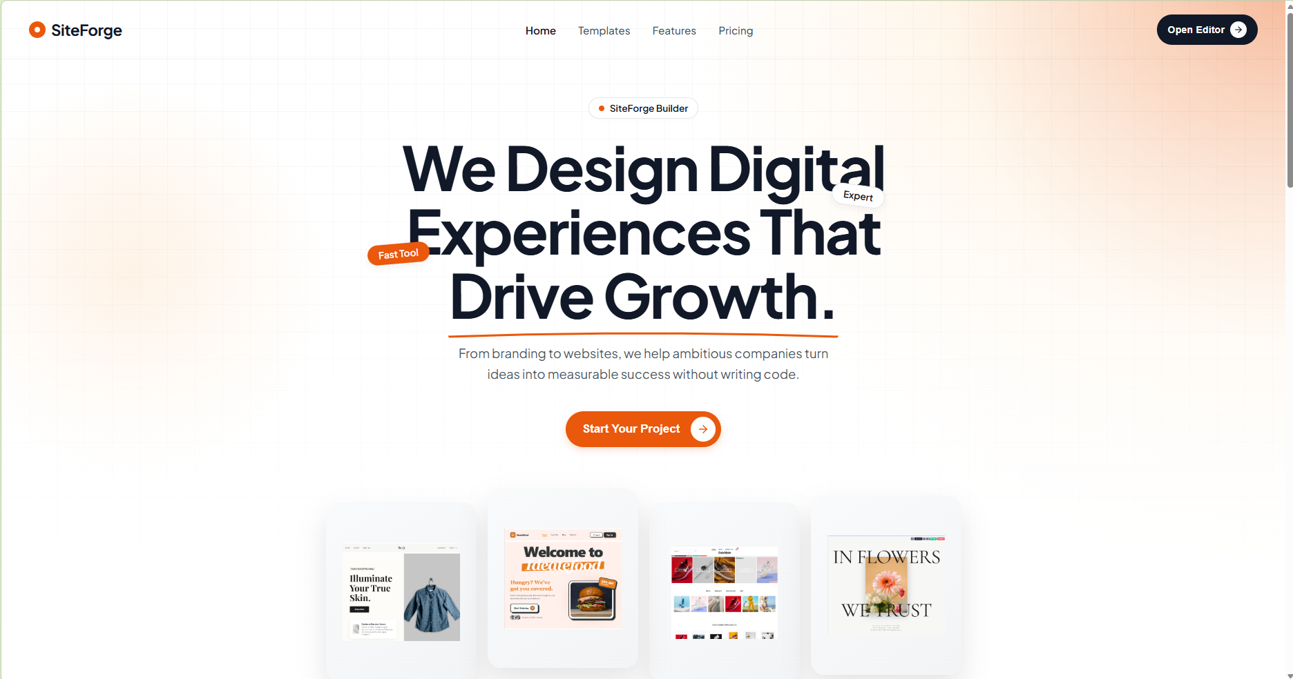
Studio Otaga is a browser-based, drag-and-drop website builder, similar to platforms like Webflow or Wix, built entirely from scratch with React. It empowers users to design complete, multi-page websites visually and export them as production-ready HTML/CSS zip files.
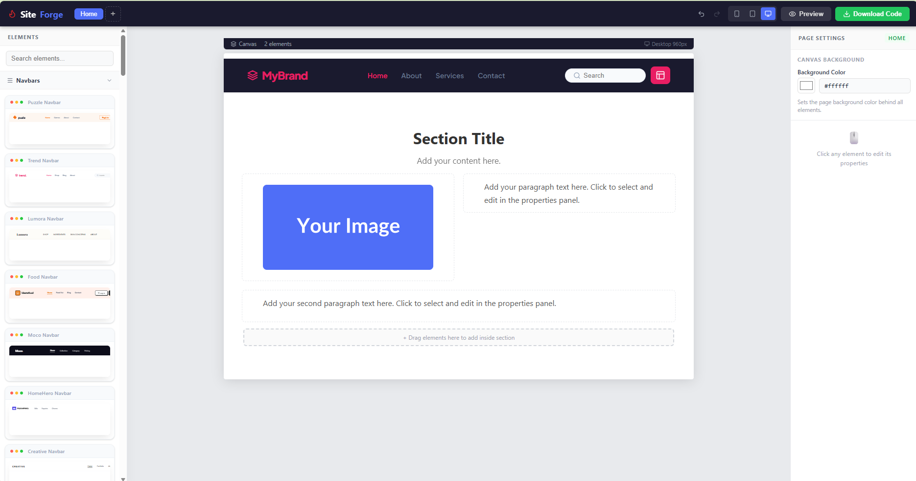
The platform features a three-panel editor architecture:
- Left Panel: An element library where users can pick and drag components (headings, buttons, images, navbars, etc.) onto the canvas.
- Center Canvas: A live visual editor where the site takes shape in real-time.
- Right Panel: A properties inspector to customize styles, text, links, and layout settings.
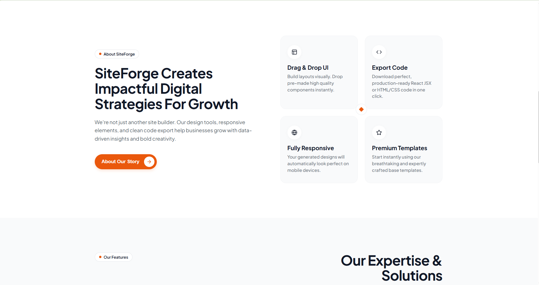
Beyond visual design, the tool includes advanced features for a complete development workflow:
- Multi-page Support: Users can create and switch between multiple pages like Home, About, and Contact.
- Responsive Preview: Real-time toggling between mobile, tablet, and desktop views to ensure pixel-perfect design across devices.
- Undo / Redo: A full edit history stack allowing for iterative design experimentation.
- Code Export: Generates clean, optimized HTML + CSS and packages it into a .zip file using JSZip for instant hosting anywhere.
Built with a modern tech stack including React, Vite, Firebase Hosting, JSZip, and Lucide-React, Studio Otaga bridges the gap between design and production. View live site →
Otaga UI Components
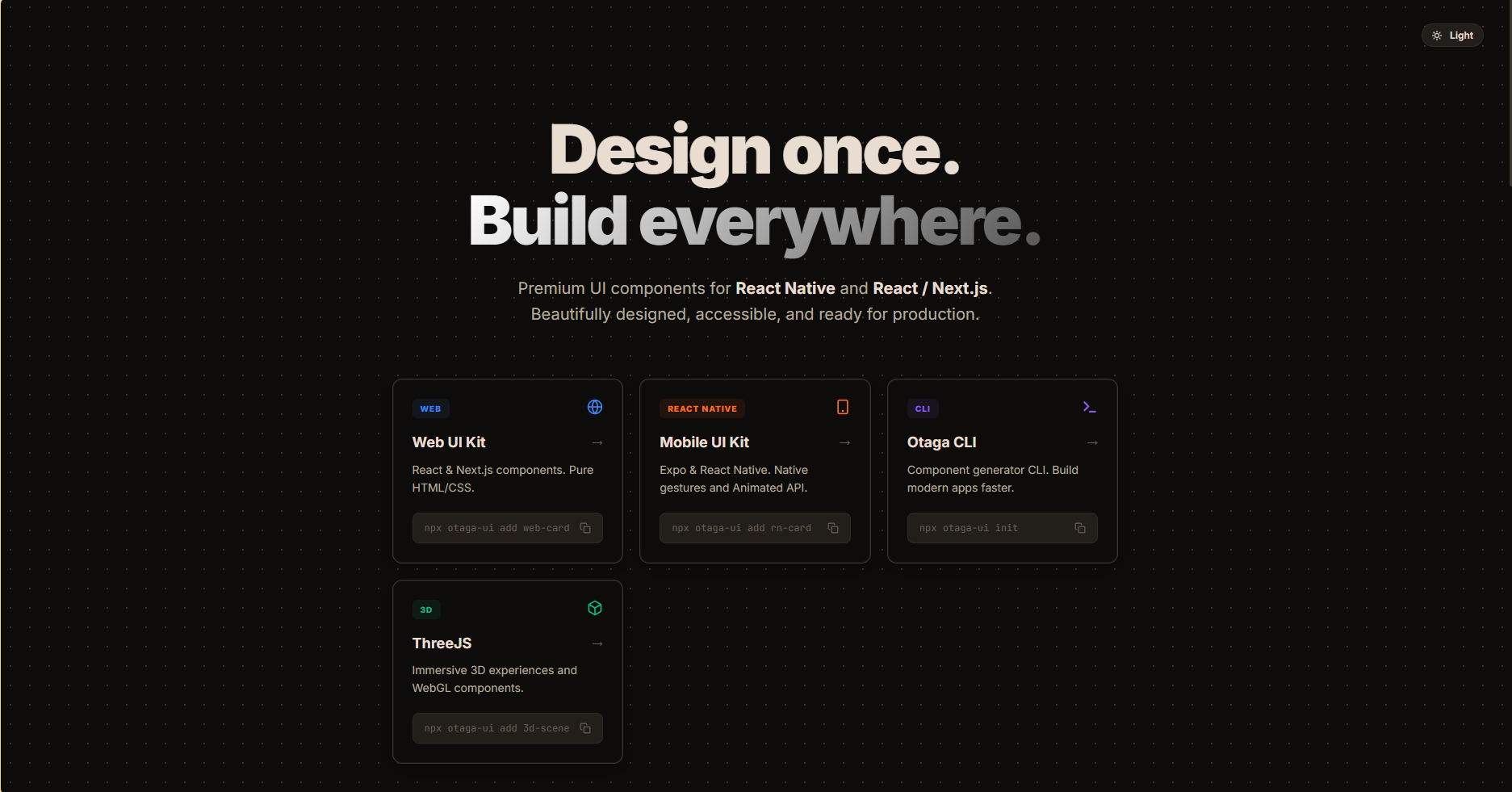
Otaga UI Components is a carefully crafted React component library aimed at accelerating web development. It offers a suite of beautifully designed, accessible, and customizable UI elements ready to be integrated into any modern application.
Key Offerings
- Pre-built Components: From complex interactive elements to simple buttons and form fields, built with modern design principles.
- Customization First: Easily adapt the look and feel to match your brand's unique design system.
- Accessible by Default: Ensures your applications are usable by everyone by following WAI-ARIA guidelines.
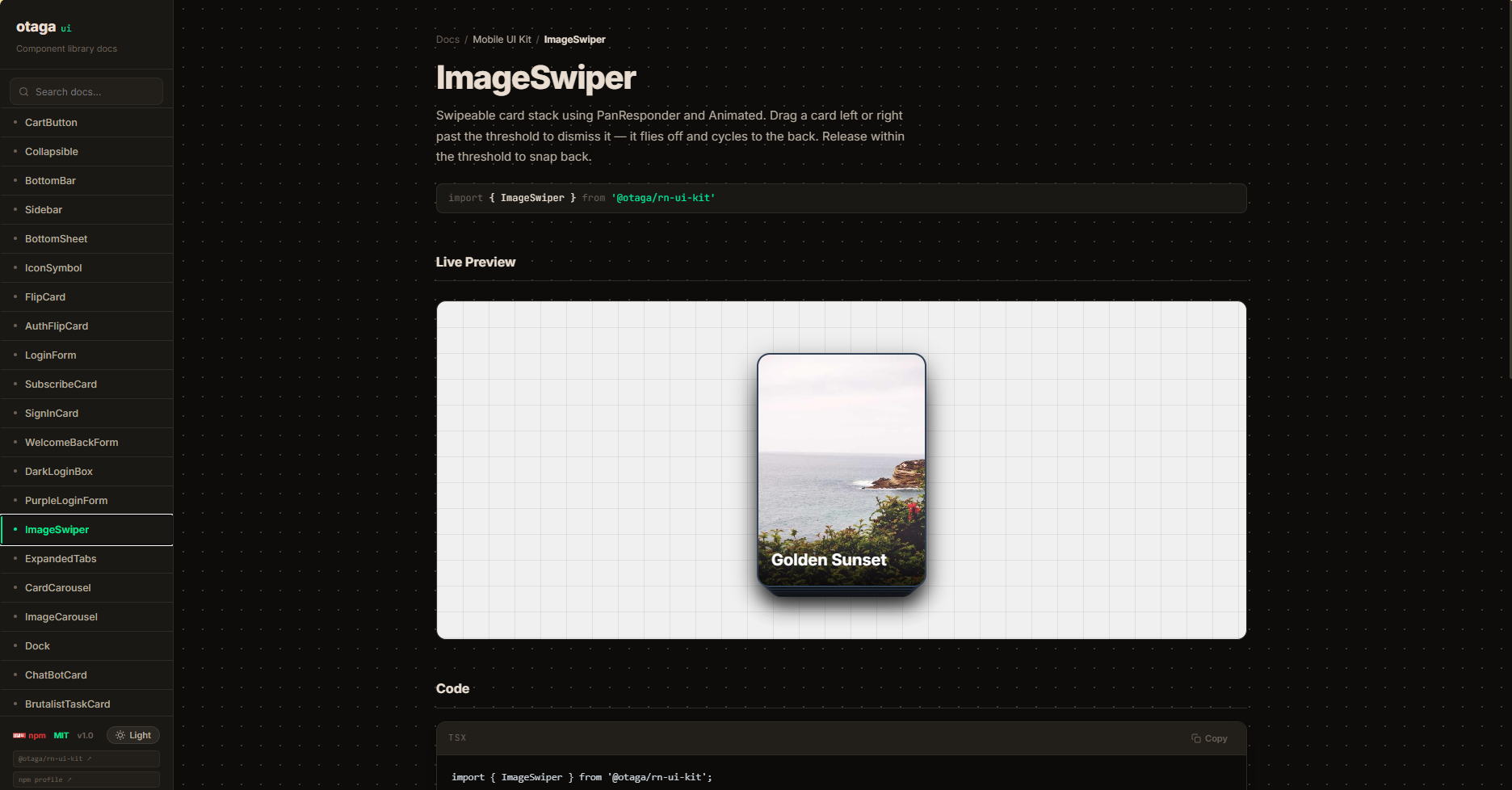
Designed with developer experience in mind, ensuring smooth integration. Explore Components →
expo-dynamic-icons (NPM Package)
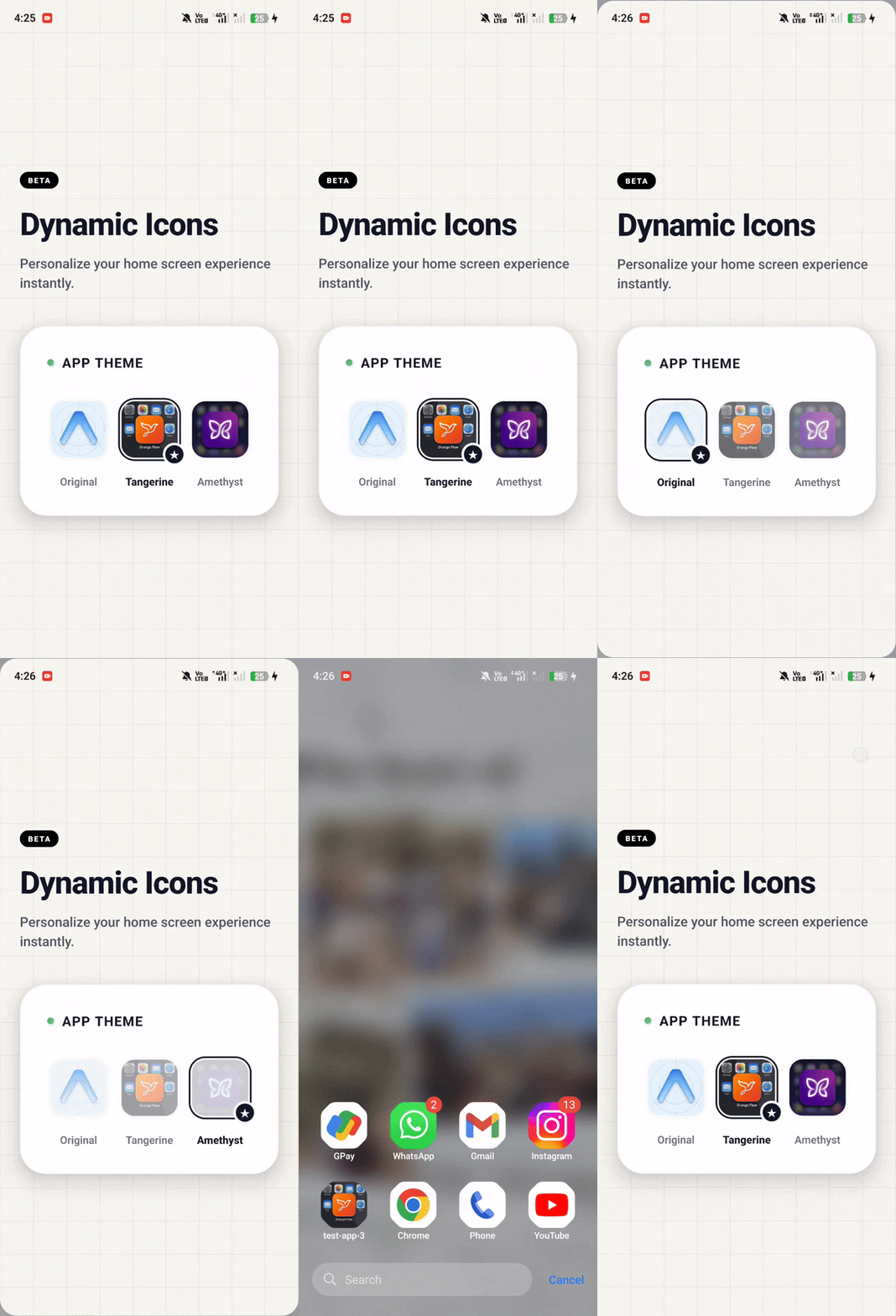
expo-dynamic-icons is an open-source NPM package created to solve a specific challenge in mobile app development: allowing users to change the app icon dynamically without pushing a new update to the app store.
Technical Highlights
- Cross-Platform Support: Works seamlessly across iOS and Android environments within the Expo ecosystem.
- Easy Integration: Simplified setup process utilizing Expo's config plugins to modify native Android (Manifest) and iOS (Info.plist) files automatically.
- Runtime Switching: Provides a straightforward API to programmatically switch app icons at runtime based on user preference or application state.
Published on NPM, it streamlines dynamic branding for Expo developers globally. View on NPM →